Last Updated: 10/1/2021
What are Shopify theme sections?
A Shopify theme section is a customizable and modular component of a Shopify theme that provides the merchant an easy way to adjust the look, layout and functionality of their store with front-end blocks.
Sections gives developers and store owners different types of settings such as color pickers, image uploads, ranges and more to populate content and build out the look and layout of their store.
You can view all the types of input settings here.
Where are Shopify sections?
Sections are contained in their own folder at the root director of a theme. They can be statically added like snippets or dynamically added from a front-end block or through a template.

For example, in /templates/product.liquid you could add {% section 'product.liquid' %} and then create the corresponding file in your sections folder to house all of the product code.
Another use for sections is a modular, customizable component that acts like a block of content inside of a page template.
How to create a Shopify section
One of the most common uses for a Shopify section is on the homepage, which in Shopify is the index.liquid template. Most store owners want to be able to update content regularly without having to code things custom each time. Sections make this super easy because you can create, drag and drop different sections around the template all without having to code anything new.
Getting Started
Let's take a look at our Shopify Tailwind Starter Theme (you can check it out here).

As you can see in the editor, there are no sections. Let's create some!
Plan your page layout
I like to do this first. Make sure you have a plan on how you want to design your page so you can create the corresponding sections. This will make the process easier so you're not designing and developing at the same time.

For my homepage, I want a big hero image with some headline text and a call-to-action button above the fold. Then I'm thinking I have a group of big columns followed by a row of smaller columns.
Creating your first section
We'll start at the top and make a section that will be a big background image with a headline and a button.
Knowing the layout, what types of inputs do we need 🤔 ?
Image picker for the hero
Text input for the headline
Text input for the button
URL for the button
To get started, find the index.liquid template and add {{ content_for_index }}. This will let Shopify know to search for the section modules in the sections folder.
Next we need to create a section. We'll call it hero_image.liquid. After that, we need to create the schema that will gives us the options to pick things like images and text. (You can view the schema docs here).
Hero Image Section
Creating your section schema
Schema is the markup that will tell Shopify how to render the block. The first thing we'll need to do is give it a name. This is the section title in the front-end editor.
{% schema %}
{
  "name": "Hero Image"
}
{% endschema %}
This is what you'll now see in the editor.

By default, the section will render inside of a div, but we can change the html element by adjusting the schema.
{% schema %}
{
  "name": "Hero Image",
  "tag": "section"
}
{% endschema %}
Schema accepts the following html element attributes:
article
aside
div
footer
header
section
This will render the following:
<section id="shopify-section-[id]" class="shopify-section">
// Output of the section content
</section>
If you need to add classes, we can do that too by adjusting the schema!
{% schema %}
{
  "name": "Hero Image",
  "tag": "section",
  "class": "home-hero-image"
}
{% endschema %}
This will render:
<section id="shopify-section-[id]" class="shopify-section home-hero-image">
// Output of the section content
</section>
Adding blocks to the schema
In our initial schema setup, we'll need to add blocks. Blocks are reusable modules of content that can be added, removed, and reordered within a section. Blocks have the following attributes:

In our block we'll need to add all of the inputs needed to display our hero image. These are all the things like image, text and url as listed above. Let start with our image. Here's what that would look like:
{% schema %}
{
   "name": "Hero Image",
   "tag": "section",
   "class": "home-hero-image",
   "max_blocks": 1,
   "blocks": [{
      "type": "image",
      "name": "Image",
      "settings": [{
            "type": "header",
            "content": "Hero Image"
         },
         {
            "type": "image_picker",
            "id": "image",
            "label": "Image"
         }
      ]
   }],
   "presets": [{
      "name": "Hero Image",
      "category": "Image",
      "blocks": [{
         "type": "image"
      }]
   }]
}
{% endschema %}
A few things to note:
We have max_blocks set to 1 because we only need 1 image

We include presets which are the default configurations of sections. You can read more about presets here. This is what the editor now looks like.

We can even choose an image now!

If you select an image, you won't see it show up! Why? Because we need to add the liquid to the section to look for that image.
{% for block in section.blocks %}
    {% if block.settings.image != blank %}
    <div id="hero-header" class="relative z-0" style="height: 30vh; background-size: cover; background-position: center ;background-image: url('{{ block.settings.image | img_url: '1800x', crop: "center" }}');">
    </div>
    {% endif %}
{% endfor %}
For images, we'll need to utilize the image liquid object as well as some of the image url size filters.
When you select an image, this is what you should see. Very nice 👏 !

While it's good that we now can populate images, it's not great because we need to change the height and adjust the image position. Let's add a slider for image height and a selector for image position. To do this, let's adjust our schema. We will add this to our block's settings:
 {
  	"type": "range",
  	"id": "image_height",
  	"min": 20,
  	"max": 100,
  	"step": 1,
  	"unit": "vh",
  	"label": "Image Height",
  	"default": 50
  }, {
  	"type": "select",
  	"id": "image_background_position",
  	"label": "Image Background Position",
  	"options": [{
  			"value": "top",
  			"label": "Top"
  		},
  		{
  			"value": "center",
  			"label": "Center"
  		},
  		{
  			"value": "bottom",
  			"label": "Bottom"
  		}
  	],
  	"default": "center"
  }
Then change our inline style to look for that new height:
height: {{block.settings.image_height}}vhand adjust our background position:
background-position: {{block.settings.image_background_position}}And now we should see this as a result:

And this is the full editor:

Fantastic! Let's create the headline text and call-to-action button. Here's the schema:
{
  	"type": "header",
  	"content": "Header Text Settings"
  }, {
  	"type": "text",
  	"id": "hero_heading",
  	"label": "Heading Text"
  }, {
  	"type": "header",
  	"content": "Button Settings"
  }, {
  	"type": "url",
  	"id": "button_url",
  	"label": "Button URL"
  }, {
  	"type": "text",
  	"id": "button_text",
  	"label": "Button text",
  	"default": "Learn more"
  }
And the html:
{% for block in section.blocks %}
    {% if block.settings.image != blank %}
    <div id="hero-header" class="relative z-0" style="height: {{block.settings.image_height}}vh; background-size: cover; background-position: {{block.settings.image_background_position}}; background-image: url('{{ block.settings.image | img_url: "1800x", crop: "center" }}');">
        <div class="z-10 h-full flex flex-col space-y-4 px-5 items-center justify-center">
            <h1 class="text-center font-extrabold text-center">{{block.settings.hero_heading}}</h1>
            <div class="mx-auto pt-3">
                <a href="{{ block.settings.button_url }}" class="px-12 py-3 rounded">
                    {{ block.settings.button_text }}
                </a>
            </div>
        </div>
    </div>
    {% endif %}
{% endfor %}
Obviously this still doesn't look right. We can't see the text because it's black and the button isn't showing up well either. Knowing that we might have many different types of images, we can't hard code color so we'll need to be able to pick the color. With that in mind, we'll also need to be able to select the button color and the button text as well. Because the image height might change, let's also make it so we can adjust text size too.

We'll update our schema to:
 {
 	"type": "header",
 	"content": "Header Text Settings"
 }, {
 	"type": "text",
 	"id": "hero_heading",
 	"label": "Heading Text"
 }, {
 	"type": "radio",
 	"id": "heading_font_size",
 	"label": "Heading Font Size",
 	"options": [{
 			"value": "text-2xl",
 			"label": "Small"
 		},
 		{
 			"value": "text-3xl md:text-3xl",
 			"label": "Medium"
 		},
 		{
 			"value": "text-3xl md:text-4xl",
 			"label": "Large"
 		},
 		{
 			"value": "text-3xl md:text-5xl",
 			"label": "XL"
 		},
 		{
 			"value": "text-3xl md:text-5xl lg:text-7xl",
 			"label": "2XL"
 		}
 	],
 	"default": "text-3xl md:text-5xl"
 }, {
 	"type": "color",
 	"id": "heading_color",
 	"label": "Heading Text Color",
 	"default": "#ffffff"
 },
 {
 	"type": "header",
 	"content": "Button Settings"
 }, {
 	"type": "url",
 	"id": "button_url",
 	"label": "Button URL"
 }, {
 	"type": "text",
 	"id": "button_text",
 	"label": "Button text",
 	"default": "Learn more"
 }, {
 	"type": "radio",
 	"id": "button_background_color",
 	"label": "Button Background Color",
 	"options": [{
 			"value": "bg-white hover:bg-gray-200 text-black",
 			"label": "White"
 		},
 		{
 			"value": "bg-black hover:bg-gray-800 text-white",
 			"label": "Black"
 		}
 	],
 	"default": "bg-white hover:bg-gray-200 text-black"
 }
And our HTML will look like:
{% for block in section.blocks %}
<div>
    {% if block.settings.image != blank %}
    <div id="hero-header" class="relative z-0" style="height: {{block.settings.image_height}}vh; background-size: cover; background-position: {{block.settings.image_background_position}};background-image: url('{{ block.settings.image | img_url: "1800x", crop: "center" }}');">
        <div class="z-10 h-full flex flex-col space-y-4 px-5 items-center justify-center">
            <div>
                <h1 style="color: {{block.settings.heading_color}};" class="text-center font-extrabold text-center {{block.settings.heading_font_size}}">{{block.settings.hero_heading}}</h1>
            </div>
            <div class="mx-auto pt-3">
                <a href="{{ block.settings.button_url }}" class="px-12 py-3 rounded {{block.settings.button_background_color}}">
                    {{ block.settings.button_text }}
                </a>
            </div>
        </div>
    </div>
</div>
{% endif %}
{% endfor %}
Our editor now looks like:

I'm still not satisfied. I think to really polish this, we need to add some sort of sub headline text and because the image is still so bright, let create an overlay so we can mute the colors a bit more.
Here's our complete hero_image.liquid
{% for block in section.blocks %}
    {% if block.settings.image != blank %}
    <div id="hero-header" class="relative z-0" style="height: {{block.settings.image_height}}vh; background-size: cover; background-position: {{block.settings.image_background_position}};background-image: url('{{ block.settings.image | img_url: "1800x", crop: "center" }}');">
        <div class="absolute h-full top-0 right-0 left-0 bottom-0" style="z-index: -1;background: rgba(0, 0, 0, {{block.settings.image_gradient_darkness}}%);" id="her-header-overlay"></div>
        <div class="z-10 h-full flex flex-col space-y-4 px-5 items-center justify-center">
            <div>
                <h1 style="color: {{block.settings.heading_color}};" class="text-center font-extrabold text-center {{block.settings.heading_font_size}}">{{block.settings.hero_heading}}</h1>
                <p class="text-center py-3 text-xl" style="color: {{block.settings.sub_heading_color}}">{{block.settings.sub_heading}}</p>
            </div>
            <div class="mx-auto pt-3">
                <a href="{{ block.settings.button_url }}" class="px-12 py-3 rounded {{block.settings.button_background_color}}">
                    {{ block.settings.button_text }}
                </a>
            </div>
        </div>
    </div>
{% endif %}
{% endfor %}
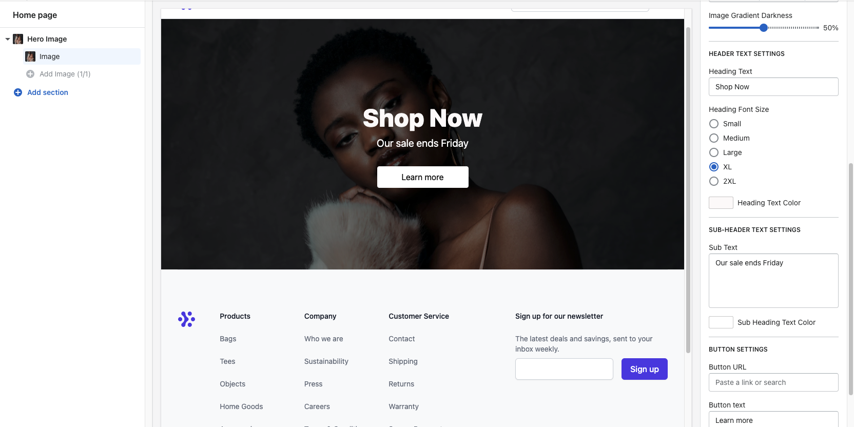
{% schema %}
{
   "name": "Hero Image",
   "tag": "section",
   "class": "home-hero-image",
   "max_blocks": 1,
   "blocks": [{
      "type": "image",
      "name": "Image",
      "settings": [{
            "type": "header",
            "content": "Hero Image"
         },
         {
            "type": "image_picker",
            "id": "image",
            "label": "Image"
         },
         {
            "type": "range",
            "id": "image_height",
            "min": 20,
            "max": 100,
            "step": 1,
            "unit": "vh",
            "label": "Image Height",
            "default": 50
         },
         {
            "type": "select",
            "id": "image_background_position",
            "label": "Image Background Position",
            "options": [{
                  "value": "top",
                  "label": "Top"
               },
               {
                  "value": "center",
                  "label": "Center"
               },
               {
                  "value": "bottom",
                  "label": "Bottom"
               }
            ],
            "default": "center"
         },
         {
            "type": "range",
            "id": "image_gradient_darkness",
            "min": 0,
            "max": 100,
            "step": 10,
            "unit": "%",
            "label": "Image Gradient Darkness",
            "default": 30
         },
{
"type": "header",
"content": "Header Text Settings"
},
{
"type": "text",
"id": "hero_heading",
"label": "Heading Text"
},
{
"type": "radio",
"id": "heading_font_size",
"label": "Heading Font Size",
"options": [{
"value": "text-2xl",
"label": "Small"
},
{
"value": "text-3xl md:text-3xl",
"label": "Medium"
},
{
"value": "text-3xl md:text-4xl",
"label": "Large"
},
{
"value": "text-3xl md:text-5xl",
"label": "XL"
},
{
"value": "text-3xl md:text-5xl lg:text-7xl",
"label": "2XL"
}
],
"default": "text-3xl md:text-5xl"
},
{
"type": "color",
"id": "heading_color",
"label": "Heading Text Color",
"default": "#ffffff"
},
{
"type": "header",
"content": "Sub-header Text Settings"
},
{
"type": "textarea",
"id": "sub_heading",
"label": "Sub Text"
},
{
"type": "color",
"id": "sub_heading_color",
"label": "Sub Heading Text Color",
"default": "#ffffff"
}, {
"type": "header",
"content": "Button Settings"
},
{
"type": "url",
"id": "button_url",
"label": "Button URL"
},
{
"type": "text",
"id": "button_text",
"label": "Button text",
"default": "Learn more"
},
{
"type": "radio",
"id": "button_background_color",
"label": "Button Background Color",
"options": [{
"value": "bg-white hover:bg-gray-200 text-black",
"label": "White"
},
{
"value": "bg-black hover:bg-gray-800 text-white",
"label": "Black"
}
],
"default": "bg-white hover:bg-gray-200 text-black"
}
]
}],
"presets": [{
"name": "Hero Image",
"category": "Image",
"blocks": [{
"type": "image",
"settings": {
"hero_heading": "REPLACE THIS TEXT",
"sub_heading": "A sub heading"
}
}]
}]
}
{% endschema %}And our finalized editor:

Now that we have the hero image completed, let's move on to the columns block. In our sections folder create a file named 2_column_page_tiles.liquid.

Because we want to create columns with an image background, text and a button, we'll re-use many of the same schema and liquid code from our hero image above. Knowing that, here's the final schema:
{% schema %}
{
   "name": "2 Column Image Tiles",
   "blocks": [{
         "type": "image",
         "name": "Image Tile",
         "settings": [{
               "type": "header",
               "content": "Image Tiles"
            },
            {
               "type": "image_picker",
               "id": "image",
               "label": "Image"
            },
            {
               "type": "range",
               "id": "image_gradient_darkness",
               "min": 0,
               "max": 100,
               "step": 10,
               "unit": "%",
               "label": "Image Gradient Darkness",
               "default": 30
            },
            {
               "type": "header",
               "content": "Tile Title"
            },
            {
               "type": "text",
               "id": "tile_text",
               "label": "Tile Title",
               "default": "Some Text"
            },
            {
               "type": "header",
               "content": "Button Settings"
            },
            {
               "type": "url",
               "id": "button_url",
               "label": "Button URL"
            },
            {
               "type": "text",
               "id": "button_text",
               "label": "Button text",
               "default": "Learn more"
            }
         ]
      }
   ],
   "presets": [{
      "name": "2 Column Image Tiles",
      "category": "2 Column Image Tiles",
      "blocks": [{
         "type": "image"
      }]
   }]
}
{% endschema %}
And here is the liquid:
<section id="{{ 'home-' | append: section.id }}">
    <div class="px-5 2xl:px-20">
        <div class="grid md:grid-cols-2 py-5 gap-5">
            {% for block in section.blocks %}
            {% if block.settings.image != blank %}
            <div class="relative z-0" style="height: 300px; background-size: cover; background-position: center ;background-image: url('{{ block.settings.image | img_url: "1800x", crop: "center" }}');" class="bg-center bg-cover bg-no-repeat">
                <div class="absolute h-full top-0 right-0 left-0 bottom-0" style="z-index: -1;background: rgba(0, 0, 0, {{block.settings.image_gradient_darkness}}%);"></div>
                <div class="flex flex-col h-full items-center justify-center space-y-3">
                    <div>
                        <div class="uppercase tracking-wider text-center text-3xl text-white"> {{ block.settings.tile_text }}</div>
                    </div>
                    <div>
                        <a href="{{ block.settings.button_url }}" class="bg-transparent border-2 border-solid border-white px-3 py-1  uppercase tracking-wider hover:bg-white hover:text-black text-white text-lg">
                            {{ block.settings.button_text }}
                        </a>
                    </div>
                </div>
            </div>
            {% endif %}
            {% endfor %}
        </div>
    </div>
</section>
And our editor will look like:

You can view the full code in our theme here 👉 https://github.com/themarketlabs/shopify-tailwind-starter-theme


